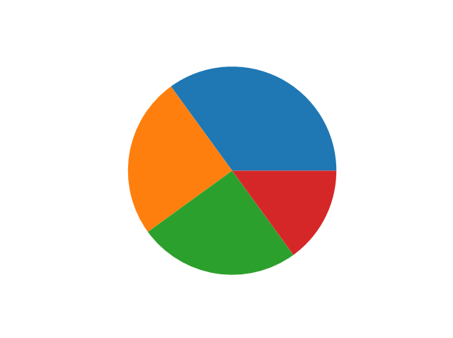
Donut Charts Explained

A donut chart, also known as a “pie chart with a hole in the center,” is a graphical representation of data in which a circle is divided into sectors, with the size of each sector representing the magnitude of the data item it represents. The donut chart gets its name from its resemblance to a donut with a hole in the center.
A donut chart can be preferable to using a pie chart since, with the pie shape, many viewers compare each section of the pie to the overall space in the center. With a donut shape, the center is removed, and viewers generally find it easier to track the magnitudes of data based on the lengths of each arc. The donut shape also leaves you more space for labeling in the center of the chart.
Donut charts are often used to show how a part of a whole is divided among multiple categories. They can be used to compare the size of different parts of a whole, or to show how a value changes over time. Here are the basic steps to creating your own donut charts, as well as some potential use cases.
Creating a Donut Chart In Excel

A donut chart is made up of a number of sectors, each of which represents a proportion of the total. The size of each sector is proportional to the value it represents, and a legend is usually included to explain the colors or patterns used.
Creating a donut chart is easy. First, you will need to select the data that you want to include in your donut chart for advanced analytics. Next, you will need to create a chart. Select your data, and go to the Insert tab in Excel. In the Charts group, select the Pie Chart button. A pie chart will be inserted, but it will not be a donut chart. To convert the pie chart to a donut chart, you will need to add a second series of data.
Select the pie chart, and go to the Design tab. In the Chart Styles group, select the More button. In the Format Chart Area window, select the Series Options tab. In the Series Options tab, select the donut chart check box. Your pie chart will now be a donut chart. You can change the colors and formatting of the donut chart as desired. Be sure to adjust the size of the sectors to match the values they represent.
Adding New Data to a Donut Chart
Donut charts are a great way to visualize data, as they allow for comparisons between data sets as well as comparisons of each data set against the whole. Of course, there are situations when new data may need to be entered to get a more accurate view of what’s going on. Particularly when converting legacy systems to master data systems during a digital transformation, it’s important to keep all data accurate and current. In order to add data to an existing donut chart, simply follow these steps:
1. Open your existing donut chart.
2. Click on the “Add Data” button in the top toolbar.
3. Select the data range you would like to add to the chart.
4. Click “OK.”
The data will now be added to the chart, and you can begin to compare it to the other data sets in the chart.
Donut Charts Use Cases

As with most data visualizations, donut charts can be used for a variety of purposes. Here are some of the most common use cases.
Donut charts are great for showing proportions. For example, you can use them to compare the proportions of men and women in a population or the proportions of different age groups in a population. Donut charts can also be used to show changes over time, such as showing how the proportions of different age groups have changed over time. Donut charts are also used to compare proportions between different data sets, like using them to compare the proportions of men and women in a population.
You can even place one donut chart inside of another donut chart to do a comparison of this year’s data vs. last year’s data. This is a great way for organizations to quickly judge their sales performance from one year to the next. Overall, you can use a donut chart in virtually any situation you can use a pie chart, but the donut chart is more precise when set up correctly.


